Drupal 7 Adding Custom CSS for Targeting Mobile Devices
Drupal 7 Adding Custom CSS for iPhones iPads & Mobile Devices
Updated: December 30th, 2020
This tutorial has been completely redone to do it the right way and “The Drupal Way” Although the old tutorial worked for iPhones, using the aspect ratios also effected other devices of similar screen ratios. These methods will also work on Drupal 6 sites.
October 10th, 2017 Removed: -webkit-min-device-pixel-ratios to pass CSS validation and added Google Nexus media queries.
Aug., 2018 – Added iPhone 10.
February 19th, 2019 – Added: Google Pixel 2 & 2XL.
February 8th, 2020 – Added: Google Pixel 3 and Google Nexus 10. Replaced depreciated min-device-width and max-device-height with new standards | min-width and max-height.
December 30th, 2020 – Updated the “Theme.info file” input tallow for Galaxy Fold width 0f 280px and added: Surface Duo & Galaxy Fold media specs.
Drupal websites tutorial to specifically target mobile devices with CSS media queries for iPhones, iPads and Galaxy S5. This includes all iPhones 4 through iPhone 7 Plus and iPhone 10 in both landscape and portrait views. It is best implemented on Drupal themes that are not 100% mobile device friendly and or, you have created custom themes, regions within your theme or, added custom blocks that to not quite display as you would like them to on all mobile devices and in both portrait and landscape modes.
This CSS tutorial is geared towards moderate to advanced Drupal developers, themers and CSS editors. You should have a good knowledge of Drupal and a good vocabulary of CSS to take advantage of this tutorial.
*Note: These techniques can be used on other CMS’s and static websites but, you will have to put the code that links your CSS file (<link media=”only screen and… ) in between the <head> and </head> section of your pages.
Making themes Responsive using CSS by targeting each device’s specific screen size, and aspect ratios individually!
Enjoy and have fun!
In this tutorial we will be focusing on the following:
Creating a iPhone and Mobile Devices Specific CSS File
The first thing is to create an css directory in you Drupal theme folder. Create an empty folder/directory named “css” within your Drupal sites theme directory. Example: sites\all\themes\YOURTHMEME\css (Note: Drupal recommends that you do not create this folder more than one level down from your themes main directory!)
Create a plain text .css file with a text editor like Notepad or the preferred Notepad++ and name it: mobile.css
Copy and paste the following into the mobile.css file:
/* iPhone 4 Portrait */
@media only screen and (min-width: 320px) and (max-width: 320px) and (orientation: portrait) {
/* Styles */
}
/* iPhone 4 Landscape */
@media only screen and (min-width: 480px) and (max-width: 480px) and (orientation: landscape) {
/* Styles */
}
/* iPhone 5 Portrait */
@media only screen and (min-width: 320px) and (max-width: 568px) and (orientation: portrait) {
/* Styles */
}
/* iPhone 5 Landscape */
@media only screen and (min-width: 568px) and (max-width: 568px) and (orientation: landscape) {
/* Styles */
}
/* iPhone 6 Portrait */
@media only screen and (min-width: 375px) and (max-width: 375px) and (orientation : portrait) {
/* Styles */
}
/* iPhone 6 Landscape */
@media only screen and (min-width: 667px) and (max-width: 667px) and (orientation: landscape) {
/* Styles */
}
/* iPhone 6 Plus, 7 & 7 Plus Portrait */
@media only screen and (min-width: 414px) and (max-width: 414px) and (orientation: portrait) {
/* Styles */
}
/* iPhone 6 Plus, 7 & 7 Plus Landscape */
@media only screen and (min-width:736px) and (max-width:736px) and (orientation:landscape) {
/* Styles */
}
/* iPhone 10 Landscape */
@media only screen and (min-width:812px) and (max-width:812px) and (orientation:landscape) {
/* Styles */
}
/* iPad Pro (10.5 inch) */
@media only screen and (min-width : 834px) and (max-width : 834px) and (orientation: portrait) {
/* Styles */
}
/* Galaxy S5, Google Nexus 5 & Google Pixel Portrait */
@media screen and (min-width: 360px) and (max-width: 360px) and (orientation: portrait) {
/* Styles */
}
/* Galaxy S5 & Google Nexus 4 & 5 Landscape */
@media screen and (min-width: 640px) and (max-width: 640px) and (orientation: landscape) {
/* Styles */
}
/* Galaxy S9 Landscape */
@media screen and (min-width: 740px) and (max-width: 740px) and (orientation: landscape) {
/* Styles */
}
/* Google Nexus 4 Portrait */
@media screen and (min-width: 384px) and (max-width: 384px) and (orientation: portrait) {
/* Styles */
}
/* Google Nexus 6 Portrait */
@media screen and (min-width: 412px) and (max-width: 412px) and (orientation: portrait) {
/* Styles */
}
/* Google Nexus 6 Landscape */
@media screen and (min-width: 732px) and (max-width: 732px) and (orientation: landscape) {
/* Styles */
}
/* Google Nexus 7 Portrait */
@media screen and (min-width: 600px) and (max-width: 600px) and (orientation: portrait) {
/* Styles */
}
/* Google Nexus 7 Landscape */
@media screen and (min-width: 960px) and (max-width: 960px) and (orientation: landscape) {
/* Styles */
}
/* Google Nexus 10 Portrait */
@media screen and (min-width: 800px) and (max-width: 1280px) and (orientation: portrait) {
/* Styles */
}
/* iPhone 10 Portrait */
@media only screen and (max-width: 375px) and (min-width: 375px) and (orientation: portrait) {
/* Styles */
}
/* iPhone 10 Landscape */
@media only screen and (min-width:812px) and (max-width:812px) and (orientation:landscape) {
/* Styles */
}
/* Google Pixel 2 & XL Portrait */
@media screen and (min-width: 411px) and (max-width: 411px) and (orientation: portrait) {
/* Styles */
}
/* Google Pixel 2 Landscape */
@media screen and (min-width: 731px) and (max-width: 731px) and (orientation: landscape) {
/* Styles */
}
/* Google Pixel 2XL Landscape */
@media screen and (min-width: 823px) and (max-width: 823px) and (orientation: landscape) {
/* Styles */
}
/* Surface Duo (portrait) */
@media only screen and (min-width: 540px) and (max-width: 540px) and (orientation: portrait) {
/* Styles */
}
/* Surface Duo (landscape) */
@media only screen and (min-width: 720px) and (max-width: 720px) and (orientation:landscape) {
/* Styles */
}
/* Galaxy Fold (portrait) */
@media only screen and (min-width: 280px) and (max-width: 280px) and (orientation: portrait) {
/* Styles */
}
/* Galaxy Fold (landscape) */
@media only screen and (min-width: 653px) and (max-width: 653px) and (orientation:landscape) {
/* Styles */
}
Open your themes .info file in a plain text editor. You will most likely find it in: sites\all\themes\YOURTHEME.info.
Copy the Stylesheets Media Link below and paste it directly under “stylesheets[screen][]= style.css”.
Go to your site and flush all caches.
Note: “YOURTHEME” will be your sites themes name.
Stylesheets Media Link:
stylesheets[only screen and (min-device-width: 280px) and (max-device-width: 960px)][] = css/mobile.css
Note: Change “YOURSITE.com” to your domain name and make any changes to the “href” path as deemed necessary. The sample above is for a Drupal multisite setup with our CSS media files in our files/assets directory.
Creating an iPad Specific CSS File
Create a plain text .css file with a text editor like Notepad or the preferred Notepad++ and name it: ipad.css
Copy and paste the following into the mobile.css file.
Save it in your sites\all\themes\css directory.
/* iPad (portrait) */
@media only screen and (min-width: 768px) and (max-width: 768px) and (orientation: portrait) {
/* Styles */
}
/* iPad (landscape) */
@media only screen and (min-width: 1024px) and (max-width: 1024px) and (orientation: landscape) {
/* Styles */
}
/* iPad Pro (portrait) */
@media only screen and (min-width : 1024px) and (max-width : 1366px) and (orientation: portrait) {
/* Styles */
}
/* iPad Pro (landscape) */
@media only screen and (min-width : 1366px) and (max-width : 1366px) and (orientation: landscape) {
/* Styles */
}
Linking your iPad.css File to your Drupal Theme
Open your themes .info file in a plain text editor. You will most likely find it in: sites\all\themes\YOURTHEME.info.
Copy the Stylesheets Media Link below and paste it directly under “stylesheets[screen][]= style.css”.
Go to your site and flush all caches.
Stylesheets Media Link:
stylesheets[only screen and (min-device-width: 768px) and (max-device-width: 1366px)][] = css/ipad.css
Testing and Editing your CSS file with Google Chrome Inspector
Note: Safari, Firefox and Internet Explorer all have similar development tools!
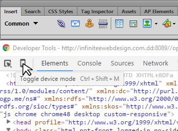
The Google Chrome Developer Tools Code Inspector (F12)
Open your site with the Google Chrome browser and either right click over an area that you want to inspect and hit “Inspector” or, with key strokes Ctrl+ Shift+ I or, (F12).
Click the Toggle device mode icon on the upper left or, use key strokes (Ctrl + Shift + M).
Refresh the browser (Ctrl + R).
You can right click over any area that you want to inspect and hit “Inspector”.
You can test and make adjustments by clicking on any piece of HTML code in the left panel. This will display the CSS that effects that bit of code.
After making some satisfactory changes to your CSS, you can either copy the rules individually and apply them to your CSS files or, click the link to your mobile.css file in the left inspector panel and it will load the file in the Sources panel. To save your edits, right click and select save as… Find your theme\css directory and save. You can also directly edit your CSS elements directly within the Sources panel before saving.
Note: Tracking down and correctly adjusting the elements in your pages can take a lot of time and you may need to use Google search for solutions for your particular CSS solutions but, the final results will keep you from loosing masses of mobile users. One site that I like for reliable CSS tips and tricks is: CSS Tricks.
The Google Chrome Developer Tools CSS Source Window
Saving your Test Edits and Applying them to your Live Site.
Once you are satisfied with all the editing of All mobile devices in the Chrome Inspector, from iPad to iPhone 4 through iPhone 6 plus in both, portrait and landscape modes, you can upload your themes\css folder and your themes .info file to their proper directories.
The themes\css folder should be uploaded to themes directory. Example: sites\all\themes
Your themes .info file should be uploaded to… Example: sites\all\themes\YOURTHEME
Go to your live site and clear all caches and go into the Chrome Developer Tools Inspector mode to review your edits and test (F12).
Note: Google recommends that you should always double check your edits on all the different mobile devices as you can to verify that your CSS rules are implemented correctly.
Call me anytime if you have any questions and…
Have fun!


